
What if you could decipher complex marketing data as simply as reading a pie chart or a line graph? In the dynamic realm of marketing, data visualisation serves as a crucial tool that transforms raw, intricate data into actionable insights. This process enables marketers to understand, interpret, and leverage data effectively, driving informed decisions and strategies. With common visualisation types such as line charts, column bars, and pie charts, organisations can swiftly derive meaning and shape their marketing agendas. Dive into our article to explore how visual storytelling could elevate your marketing strategies, making your approach as effective as it is insightful.
Transforming Marketing Data into Visual Insights
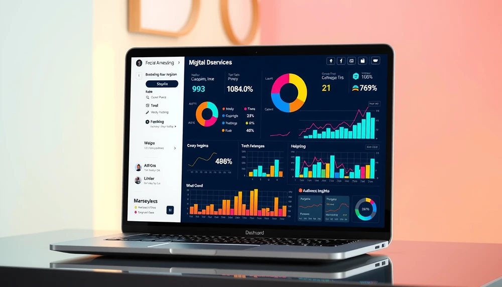
Data visualisation is pivotal in marketing analytics, enabling marketers to convert complex data into understandable visuals. This process facilitates data storytelling, allowing for a clearer interpretation of trends and patterns that would otherwise remain hidden in raw data. As a result, marketers can make more informed strategic decisions.
Common visualisation types play distinct roles in marketing. Line charts effectively showcase trends over time, providing insights into sales performance or customer engagement patterns. Column and bar charts are ideal for comparing different metrics, such as advertising spend across various channels, enabling marketers to allocate resources more efficiently. Pie charts, on the other hand, are used to illustrate portions of a whole, helping to understand market share distribution or the composition of customer segments.
These visual tools not only simplify data interpretation but also enhance decision-making processes. By presenting data in an accessible format, stakeholders can quickly grasp key insights, leading to more agile and responsive marketing strategies. This visual clarity transforms data into actionable insights, empowering marketers to optimise campaigns, refine targeting, and ultimately, achieve better outcomes.
Effective Visual Marketing Tools to Enhance Insights
Visual marketing tools are instrumental in transforming complex data into actionable insights, enhancing both understanding and communication. These tools facilitate interactive data visualisation, allowing marketers to explore real-time data and make informed decisions swiftly. By converting intricate datasets into digestible visuals, businesses can optimise their strategies and improve performance outcomes.
Key tools in the realm of data visualisation include:
- Tableau: This tool provides both desktop and cloud-based business intelligence (BI) capabilities. Known for its robust analytics and visually appealing dashboards, Tableau allows users to interact with data through intuitive drag-and-drop features, making it accessible for non-technical users.
- Looker Studio: Formerly Google Data Studio, Looker Studio is a free visualisation tool with strong capabilities. It integrates seamlessly with Google services and other data sources, offering a platform to create custom dashboards and reports that illustrate data trends and insights effectively.
- Microsoft Power BI: Known for its interactive dashboards, Power BI offers a suite of business analytics tools that deliver insights throughout an organisation. It enables users to connect to hundreds of data sources and create visually appealing reports that can be shared across teams for collaborative insights.
These tools offer significant benefits by enabling real-time data interaction. With capabilities to update data automatically, they reduce the need for manual data entry, ensuring that decisions are based on the most current information. This immediacy enhances strategic agility, allowing businesses to respond promptly to market changes and optimise their marketing efforts effectively. Through these visualisation tools, marketers can not only interpret data with ease but also communicate findings clearly to stakeholders, fostering a data-driven culture within the organisation.
Understanding Consumer Behaviour Through Data Visualisation
Visualising consumer data is essential for businesses aiming to gain insights into audience segmentation and understand the customer journey. By transforming raw data into visual formats, marketers can interpret complex patterns and behaviours that drive consumer interactions. This process is instrumental in identifying key trends and preferences, enabling more precise targeting and engagement strategies.
| Visualization Type | Use in Consumer Behaviour |
| Heat Maps | Track consumer interactions |
| Funnel Charts | Visualise customer journeys |
| Pie Charts | Segment audience preferences |
Heat maps are particularly useful for tracking consumer interactions on websites or digital platforms, highlighting areas of high engagement and potential drop-off points. Funnel charts illustrate the various stages of the customer journey, allowing marketers to pinpoint where customers may be abandoning the process. Pie charts offer a clear depiction of audience segmentation, breaking down data into understandable portions that reveal customer preferences and demographic insights.
These visual insights empower marketers to refine their strategies effectively. By understanding where customers engage most or drop off, businesses can optimise their user experience, adjust messaging, and tailor marketing efforts to better meet consumer needs. Such data-driven adjustments not only enhance customer satisfaction but also improve conversion rates, proving the value of data visualisation in strategic marketing planning.
Best Practices for Implementing Data Visualisation in Marketing
Choosing the appropriate visualisation type is critical in data-driven marketing strategies. This decision impacts how effectively data insights are communicated and understood. For instance, line charts are often suitable for illustrating trends, while bar charts are ideal for comparing different data points. Selecting the correct type ensures that the data’s story is conveyed accurately and compellingly.
Simplicity is another cornerstone of effective data visualisation techniques. Complex graphics can overwhelm stakeholders and obscure key insights. By focusing on clear, uncluttered visuals, marketers can enhance comprehension and facilitate swift decision-making. Simple charts and graphs that highlight essential metrics allow for quicker interpretation and action.
- Choose appropriate visualisation types.
- Keep visuals simple and relevant.
- Ensure logical metric interrelation.
- Maintain consistent naming structures.
- Include context and analysis in reports.
Logical interrelation of metrics is paramount when effectively using charts and graphs. This involves ensuring that all data points presented are interconnected in a way that supports clear, cohesive narratives. Consistent naming structures across campaigns and reports further ensure clarity and help avoid confusion. This consistency aids in tracking performance over time, making it easier to draw comparisons and extract meaningful insights.
Including context and analysis in reports transforms raw data into actionable intelligence. By providing background information and interpretative commentary, reports become more than just numbers; they become tools for strategic planning. This approach ensures clients can understand and utilise insights effectively, fostering informed decision-making processes.
Implementing these best practices leads to clearer insights and improved marketing strategies. When data is presented effectively, it empowers marketers to optimise campaigns, enhance targeting precision, and ultimately achieve better results. Through thoughtful visualisation, data becomes a powerful asset in driving strategic growth and innovation.
Case Studies: Successful Use of Data Visualisation in Marketing
Case studies provide invaluable real-world insights into how data visualisation can transform marketing strategies. By examining specific examples, marketers can better understand the practical applications and benefits of using visualisation tools to interpret marketing data, enhance campaign performance analysis, and boost sales with data insights.
Case Study 1: B2B Marketing Analytics
In the realm of B2B marketing, visualisation tools have played a pivotal role in enhancing campaign performance. A leading B2B company utilised advanced visual analytics to monitor and optimise their multi-channel marketing efforts. By employing interactive dashboards, they could visualise key performance indicators (KPIs) across different platforms, providing a comprehensive view of campaign effectiveness.
The result was a marked improvement in resource allocation, as the company could identify underperforming channels and reallocate budgets accordingly. This targeted approach led to a 30% increase in lead generation within six months, demonstrating the power of data-driven decision-making facilitated by visualisation.
Case Study 2: Outbound Marketing Optimisation
In outbound marketing, data visualisation has been instrumental in refining strategies and enhancing sales outcomes. A major retail brand used heat maps and funnel charts to track consumer interactions and optimise their outbound efforts. By visualising customer touchpoints, the company identified bottlenecks in their sales process and adjusted their marketing tactics to address these issues.
The impact was significant: conversion rates increased by 25%, and overall sales improved by 15% over the course of a year. The ability to interpret complex consumer behaviour data visually allowed the brand to make informed decisions swiftly, optimising their outbound campaigns for better results.
These case studies highlight the substantial benefits of incorporating data visualisation into marketing strategies. By transforming complex datasets into actionable insights, businesses can make informed decisions with greater precision, ultimately leading to enhanced marketing performance and increased sales.

Final Words
Transforming complex marketing data into understandable visual insights significantly aids decision-making. Data visualization simplifies assessing trends and comparing metrics, enhancing strategic choices. Utilising effective visual marketing tools, such as Tableau and Power BI, further enriches insights with real-time interactivity.
Understanding consumer behaviour through visualisation, using tools like heat maps, improves audience segmentation and strategy refinement. Following best practices ensures clarity in reports and improves communication of insights.
Integrating data visualisation into marketing provides compelling analytics, driving optimized strategies. These practices deliver tangible benefits, effectively maximising data’s potential in enhancing marketing outcomes.
FAQ
How is data visualization used in marketing?
Data visualization in marketing involves transforming raw data into visual formats like charts and graphs, facilitating easier understanding and analysis. This process aids marketers in making data-driven decisions to improve strategies effectively.
What are insights in data visualization?
Insights in data visualization are actionable findings derived from analysing graphical representations of data. These insights help marketers understand trends, patterns, and consumer behaviour, leading to informed decision-making and strategy enhancement.
What are the 5 C’s of data visualization?
The 5 C’s of data visualization typically include the following elements: Clear, Concise, Connected, Compelling, and Correct. They guide the creation of effective visuals that communicate complex data simply and accurately.
What are the 3 C’s of data visualization?
The 3 C’s of data visualization focus on Clarity, Context, and Consistency. These elements ensure that visual presentations of data are easy to understand, relevant to the audience, and uniform in style and presentation.
What are examples of marketing data visualisation tools?
Examples of marketing data visualization tools include Tableau for comprehensive BI solutions, Looker Studio for powerful free capabilities, and Microsoft Power BI for creating interactive dashboards that aid in decision-making.
How does Google Data Studio enhance marketing efforts?
Google Data Studio enhances marketing by enabling the creation of detailed, interactive reports and dashboards. This tool supports real-time data analysis, allowing marketers to track campaign performance and adapt strategies swiftly.
What role does Looker Studio play in data visualization?
Looker Studio provides powerful data visualization capabilities useful for marketers to create dynamic reports and dashboards. It aids in visualizing complex data sets, helping to unveil insights and support strategic decision-making.
How can Google Charts be utilized in marketing?
Google Charts can be employed in marketing to create straightforward visual representations of data, such as pie charts and bar graphs. These are useful for displaying metrics like market segmentation and sales distribution effectively.
For professional support with this, see our PPC management.
For professional support with this, see our digital marketing services.
For professional support with this, see our web design services.
For professional support with this, see our about Smarter Digital Marketing.
For professional support with this, see our local SEO across Scotland and the UK.
