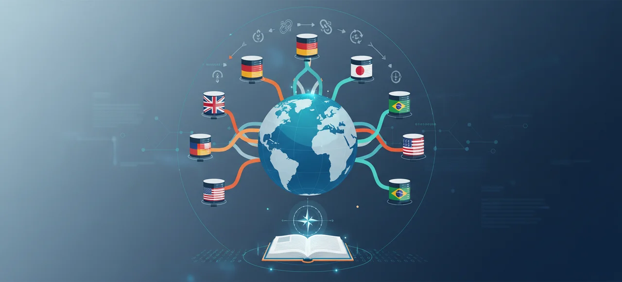
Have you ever wondered why a room painted in blue feels calming, while a red one feels energising? Colours are more than just visual stimuli—they have a profound impact on our emotions. Understanding how colours influence feelings can be a game-changer for businesses and interior designers alike. This article delves into the psychology of colours, illuminating how different hues can evoke specific emotional responses. By the end, you’ll understand how to strategically use colours to enhance moods, drive consumer behaviour, and elevate brand perception.

Understanding the Psychology of Colours

Colour psychology examines how different colours influence human emotions and behaviours. This field explores how colours can evoke specific emotional responses and associations, which can be strategically applied in areas such as marketing, branding, and interior design.

Different colours trigger varied emotional responses. Red, for instance, stimulates energy and passion, making it effective in contexts requiring high energy or urgency. Blue, on the other hand, promotes calmness and trust, often used in professional and corporate settings to convey reliability. Yellow can evoke feelings of happiness and optimism, while green is associated with nature and tranquillity, promoting relaxation and balance.

Common colour associations include:

  • Red: Energy, passion, urgency
  • Blue: Calm, trust, professionalism
  • Yellow: Happiness, optimism, warmth
  • Green: Nature, tranquillity, balance
  • Black: Power, sophistication, elegance
  • White: Purity, cleanliness, simplicity

Colour Psychology How Colours Influence Emotions

The Impact of Colours in Marketing and Branding

Colour plays a pivotal role in branding, shaping consumer perceptions and fostering brand recognition. By strategically selecting colours, brands can communicate core values and evoke specific emotional responses in their audience. For instance, the colour red is often associated with excitement and urgency, making it a popular choice for impulse-buy products and clearance sales. Blue, conversely, conveys trust and stability, which is why financial institutions and tech companies frequently utilise it.

In marketing campaigns, colours are chosen to align with the desired emotional response and target audience. For example, green is often used in campaigns promoting eco-friendly products due to its association with nature and health. Yellow, known for its ability to grab attention and evoke happiness, is commonly used in advertisements targeting younger demographics or promoting leisure activities. Brands meticulously select colours to create the desired impact, enhancing the overall effectiveness of their campaigns.

Specific brands have successfully leveraged colour to reinforce their identity. Coca-Cola’s iconic red packaging is designed to evoke excitement and passion, aligning with its brand message of joy and celebration. Conversely, Facebook’s blue interface aims to create a sense of trust and reliability, crucial for a social media platform that handles personal data. McDonald’s uses a combination of red and yellow, capitalising on red’s urgency and yellow’s friendliness to appeal to children and families.

Smarter Digital Marketing can optimise colour usage in marketing strategies by conducting thorough market research and colour psychology analysis. By understanding the target audience and the psychological effects of different colours, they can develop highly effective branding and marketing campaigns. This approach ensures that the chosen colours resonate with consumers, thereby enhancing engagement and driving conversions.

Colour Psychology in Interior Design

Colour psychology plays a significant role in interior design, influencing the mood and atmosphere of a space. Interior designers use colour to create specific emotional responses, enhancing the functionality and aesthetic appeal of rooms. By understanding the psychological impact of different colours, designers can craft environments that promote well-being and productivity.

Warm colours, such as red and orange, are known to stimulate feelings of warmth and comfort. Red can make a room feel cosy and inviting, making it suitable for social areas like living rooms and dining rooms. Orange, associated with enthusiasm and creativity, can invigorate spaces like home offices or creative studios. On the other hand, cool colours like blue and green are ideal for creating calm and relaxing environments. Blue promotes tranquillity and is often used in bedrooms and bathrooms to encourage rest and relaxation. Green, symbolising nature and balance, works well in living areas and kitchens to create a refreshing and rejuvenating atmosphere.

Practical tips for choosing colours in interior design include considering the room’s purpose, lighting conditions, and personal preferences. For instance, lighter shades can make a small room appear more spacious, while darker hues can add depth and intimacy to larger spaces. It is also essential to balance bold colours with neutral tones to avoid overwhelming the senses. Testing colour samples in different lighting conditions can help ensure the chosen colours achieve the desired effect.

Colour Effect
Red Cosiness, warmth
Orange Enthusiasm, creativity
Blue Tranquillity, calm
Green Balance, rejuvenation
Yellow Happiness, energy
Purple Luxury, sophistication

The Cultural Significance of Colours

Understanding colour in cultural contexts is crucial for effective communication and design. Colours carry different meanings and emotional weight across various cultures, influencing how messages are perceived globally.

In Western cultures, white typically symbolises purity and innocence, whereas in many Eastern cultures, white is associated with mourning and loss. Red signifies good fortune and happiness in China, making it a popular choice for celebrations and weddings. Conversely, in South Africa, red represents mourning and is often used in funerals. Green, which often symbolises nature and tranquillity in Western contexts, holds religious significance in many Islamic countries, representing paradise and prosperity.

Historically, colours have been used to convey power and status. In ancient Rome, purple was reserved for emperors and high-ranking officials due to its rarity and cost. Egyptian pharaohs often wore blue as a symbol of divinity and protection. Similarly, medieval European royalty utilised colours like gold and crimson to denote wealth and authority.

For global marketing and design, understanding these cultural nuances is essential. Brands must carefully select colours that resonate positively with their target audiences in different regions. Missteps in colour choices can lead to miscommunication and even offend potential customers. Therefore, a nuanced approach to colour selection can enhance brand perception and ensure successful cross-cultural marketing campaigns.

Psychological Effects of Specific Colours

Red

Red is commonly associated with excitement, energy, and passion. It can stimulate the senses and increase heart rates, making it effective for creating a sense of urgency or highlighting important elements.

  • Energy
  • Passion
  • Urgency
  • Excitement

Blue

Blue often signifies calmness, stability, and trust. It has a soothing effect on the mind, which can foster a sense of reliability and professionalism. This makes blue a popular choice for corporate and financial settings.

  • Calmness
  • Stability
  • Trust
  • Professionalism

Yellow

Yellow is linked to happiness, optimism, and warmth. It is a bright and attention-grabbing colour that can evoke feelings of joy and positivity. This makes yellow an excellent choice for stimulating mental activity and uplifting moods.

  • Happiness
  • Optimism
  • Warmth
  • Positivity

Green

Green is associated with nature, tranquillity, and balance. It promotes a sense of harmony and relaxation, often used in environments where stress reduction is a priority. Green is also linked to health and renewal.

  • Nature
  • Tranquillity
  • Balance
  • Relaxation

Black

Black can denote power, sophistication, and elegance. It is often used to convey a sense of authority and formality. Black can also create a mysterious or luxurious atmosphere, making it suitable for high-end products and services.

  • Power
  • Sophistication
  • Elegance
  • Authority

White

White typically signifies purity, cleanliness, and simplicity. It can create a sense of space and openness, often used to convey a minimalist and modern aesthetic. White is also associated with freshness and new beginnings.

  • Purity
  • Cleanliness
  • Simplicity
  • Freshness

Practical Applications of Colour Psychology in Everyday Life

Colour psychology can significantly impact educational environments. Bright colours like yellow and orange can enhance learning and engagement by stimulating mental activity and creating a lively atmosphere. These colours can be particularly effective in classrooms and study areas, where maintaining student attention and motivation is crucial. Additionally, blue and green can create a calming environment conducive to focused study sessions, reducing anxiety and helping students concentrate.

In therapeutic settings, colour plays a vital role in promoting relaxation and healing. Soft, calming colours such as blue, green, and lavender are often used in therapy rooms and healthcare facilities to create a soothing atmosphere. These colours can help reduce stress and anxiety, contributing to a more effective therapeutic experience. For instance, green’s association with nature and tranquillity can foster a sense of peace, aiding in the mental and emotional healing process.

Advertising and food branding also benefit from the strategic use of colour psychology. In advertising, colours are chosen to evoke specific emotional responses and attract target demographics. For example, red can create a sense of urgency, making it effective for clearance sales and impulse buys. Yellow, associated with happiness and energy, can grab attention and evoke positive emotions, making it ideal for leisure products and services. In food branding, colours like red and yellow can stimulate appetite and excitement, commonly used by fast-food chains to attract customers.

Additional practical applications of colour psychology include:

  • Retail Environments: Colours can influence shopping behaviour and time spent in stores.
  • Workspaces: Calming colours can enhance productivity and reduce stress.
  • Healthcare: Colour-coded areas can assist in wayfinding and reduce patient anxiety.
  • Sports: Team colours can boost morale and create a sense of unity.
  • Personal Spaces: Home decor choices can impact mood and well-being.

Final Words

Colour psychology reveals how hues influence emotions and behaviours. This knowledge is pivotal for marketing, branding, and interior design strategies. Red evokes urgency and passion, while blue instils calm and trust, showcasing the diverse impact of different colours.

Understanding these principles can significantly enhance engagement and convey desired messages effectively. Smarter Digital Marketing can help you utilise these strategies for optimal results.

Leveraging colour psychology can transform your approaches, leading to improved user satisfaction and higher conversion rates. Embrace the power of colours to drive your success.

FAQ

What is colour psychology?

Colour psychology studies how colours affect human emotions and behaviour. Colours can evoke specific feelings, from calm and trust to energy and passion.

How do colours influence emotions?

Colours can trigger various emotional responses. For example, red often stimulates excitement and energy, while blue promotes calm and trust.

What are common colour associations in marketing?

Common colour associations in marketing include:

  • Red: urgency and excitement
  • Blue: trust and reliability
  • Yellow: optimism and happiness
  • Green: nature and tranquillity
  • Black: power and sophistication
  • White: purity and cleanliness

How is colour psychology used in marketing and branding?

Colours in branding and marketing can influence consumer perceptions and behaviours. Red creates urgency for sales, while blue enhances trust for financial institutions.

How do different cultures perceive colours?

Colours have different meanings in various cultures. White signifies purity in Western cultures but can mean mourning in Eastern cultures.

What are the psychological effects of red?

Red is associated with excitement and energy. It stimulates the appetite and can signify danger or passion.

What are the psychological effects of blue?

Blue promotes calm and trust. It’s often used in corporate branding to convey reliability and stability.

How do warm and cool colours affect interior design?

Warm colours like red and orange make spaces cosy and inviting, while cool colours like blue and green create calming environments.

What are practical applications of colour psychology in everyday life?

Colour psychology has practical applications in education, therapy, advertising, and food branding. Bright colours can enhance learning, while calming colours promote relaxation in therapeutic settings.